Sometimes you just want a pretty picture. Sometimes you need more than that.
For those of us who deal in website content for a living, social media is a mixed blessing. It certainly increases the reach of any article, photo or video we put out there. It allows for almost instant feedback and interaction with readers, which is generally positive. However, it has definitely changed the way people read (or don’t read) content and that has an affect on how we present things. Headlines and images take on added importance when people are likely to see them and even comment on them without viewing the content of the article.
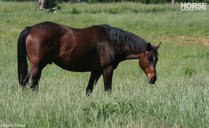
For us, images that we include to accompany articles can overshadow the article itself on Facebook. The other day we posted a link to an older Ask the Expert column about knowing when it’s time to say goodbye to an aging horse. The reader who wrote the question specified that her horse was a mare. The photo I put with it was of a gelding, which several Facebook commenters pointed out. Others posted things like, “I think your horse looks great for her age!”
Not a mare. Not 30. Probably not dying. Just a pretty picture of a pretty horse.
The first such comment struck me as an anomaly. People don’t really expect the photo to be of the horse in the question, do they? But once you see a half dozen or so comments like that, you have to accept that it requires clarification, and that was the inspiration for this blog post.
So, the eagle-eyed Facebookers who spotted the gelding’s gelding bits were correct. The horse in the photo is not the 30-year-old mare in question. We print a lot of reader Q&As, both in the magazine and on the website, and we don’t ask or expect readers to submit a photo with their question. We try to find something illustrative to go with it, especially when it’s a training question, but sometimes it’s just for visual appeal. Does a photo of a horse in a field help you understand the article better? Would any photo? Probably not in this case, but it’s just nicer to look at than a wall of words.
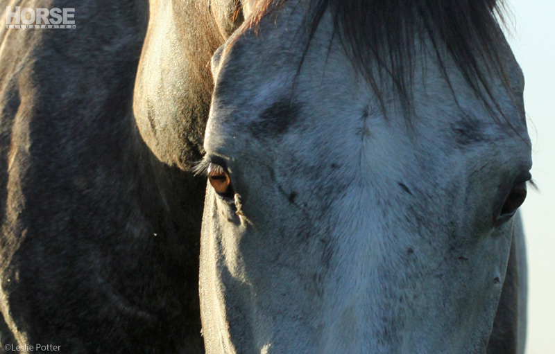
Articles on the sort of downer topics—euthanasia, stolen horses, horse memorials—are tough. For whatever reason, I always want to put silhouettes or horse-eye close-ups with those. Maybe because it makes it more anonymous and less like I’m picking a particular real-life horse to illustrate death. I made a conscious decision to break that habit this time (that’ll teach me!) Instead, I chose what struck me as a quiet horse relaxing in a field. Looks like he could be retired, right? Sure, he doesn’t look 30, but he doesn’t look any other age, either. He’s that sort of anonymous plain-brown-wrapper horse who serves as a stand in for the anyhorse.
Very generally speaking, here’s what I look for when selecting a photo to go with an article on HorseChannel.
- Relevance:
Does the photo illustrate the article? If it’s a personal column about a specific horse, I ask the writers to include a photo. When reading about someone’s childhood pony, you want to see the actual pony, not some stock photo imitation. If it’s an instructional article, I try to use something that serves as a visual aid to help readers understand the process. We’ll set up photo shoots specifically for that purpose for the training features you see in the magazine. In most other cases where the photo is just decoration, I go for the image that’s nicest to look at that is somehow related to the topic at hand. Pretty straightforward. - Good Horsemanship/Safe Practices:
Unless it’s an article specifically discussing bad horsemanship, I try to make sure everything in the image would pass Pony Club inspection. I think it’s important that we practice what we preach, too. In any fencing article we’ve run, you’ll probably see an explanation for why barbed wire is not a good option for horse properties, so we don’t want you to click the related link and see barbed wire in the background of an otherwise nice photo. We’ll also rarely ever publish a photo with an unhelmeted English rider and we prefer helmets for any discipline. But we have to depict what exists in the real world and sometimes what exists is cowboy hats. - Visual Appeal:
An important component of my work here at HorseChannel is putting more pretty photos of horses out into the world. So that means that once the relevance thing is assured, I always want to choose the image that is just plain beautiful. It also means that I’m usually going to lean toward photos with actual horses in them. For example, I generally assume people would rather see a photo of a horse eating hay than just a still-life image of a bale of hay in an article about nutrition. - Orientation:
Horizontal photos work best when you’re reading articles on your computer. But more and more of our site visitors are reading from their phones now—more than half of our traffic is mobile. Since people tend to hold their phones vertically when reading, it makes sense to use vertical photos. However, when those articles go on Facebook, Facebook auto-crops square and vertical images down to a horizontal sliver of the midsection of the image. This can create awkward results. So I still lean toward horizontal images online, although less so than I used to. - Controversy Aversion:
If I find a really nice stock photo of a pretty horse, then notice that the horse is in a mule bit, I will probably not use the photo. Why? Because someone will notice and comment that mule bits are harsh and cruel, and that will derail the conversation. Doesn’t matter that the article itself was about detangling manes or cleaning bridles or something. The bit will be a distraction. This relates to No. 2 in that I’ve noticed that any time a photo of a helmetless rider appears on a popular social media page, there will be multiple comments along the lines of, “Where is the helmet?” So I guess this one is less about how I might feel about a certain bit or helmets or barbed wire or anything else and more about trying to rid the photo of irrelevant distractions. - Snoopy:
I take a lot of the photos that appear on HorseChannel, and so it follows that my own horse would be forced into modeling for a lot of them. He’s simply the equine most available to me. But he’s also super handsome. So if you feel like you’ve been seeing the same adorable black horse appear frequently around the site, you’re probably not wrong.

We do the best we can.
In hindsight, I could have avoided the distraction in the case of the non-mare by selecting a photo of a horse that wasn’t a gelding (or at least couldn’t be visually identified as one.) But that wouldn’t have solved the confusion for people who thought the horse “looked great for her age.” I’m not sure there’s a simple solution for this, but I’m open to suggestions. In any case, I hope you enjoy the photos we do select to run with our articles and they don’t cause too much confusion.
Back to The Near Side
Leslie Potter is Sr. Associate Web Editor of HorseChannel.com. Follow her on Twitter: @LeslieInLex.