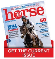
Here at the Horse Illustrated offices, a lot of effort goes into creating the cover each month. We sift through hundreds of thousands of images from top equestrian photographers, looking for the perfect shot of the perfect horse to represent the issue. The image of the cover horse is what you see first on the newsstands or when you open your mailbox. We want it to catch your eye and make an instant connection. We look for just the right words to convey the content within so you don’t overlook a great article. Our talented designer puts it all together, and another issue of Horse Illustrated is born.
Of course, it’s not easy to agree on what makes the perfect cover. We usually have three different cover photos in the running each month and go through several rounds of design revision incorporating different color schemes and fonts. Along the way, we have many debates about which cover is the best. We all have our favorites but ultimately, we are looking for covers that Horse Illustrated readers will love.
So, we’d like to get your opinion. Vote on the best cover of 2011 (the voting box is on the left side of the page), and leave a comment telling us about your favorites, and what you think makes a great Horse Illustrated cover.
 January |  February |  March |
 April |  May |  June |
 July |  August |  September |
 October |  November |  December |
Back to The Near Side


In my opinion a great cover needs a great photo that is not only clear but also utilizing nice contrasting colours that make it stand out. E.g. the black Friesian against the white snow is perfect contrast.
I also think it’s really neat that the title is incorporated into the photo. I.e. that the horse’s ears go over the text, etc.
Anyway, my favourite cover is a toss up between January and July.
My least favourite is April, closely followed by June.
I love the June 2011 edition. As a big fan (and owner) of paints, it just appeals to me immensely.
All the covers are great. I like the way the “headlines” are on the cover-that piques my interest in what is inside-it also helps me find a “lost” article when I look for articles on certain subjects.